Monday, 30 November 2009
Name of Magazine.

Tuesday, 24 November 2009
Photoshoot

This is the sort of photo i would like, however it is not a medium close up so i would have to crop it or do a slightly closer up shot.

This image includes both male and female and creates the topic of relationship. This image is also a good representation of the medim close up i would like on my magazine.
Weekly Review and Questionnaire Analysis
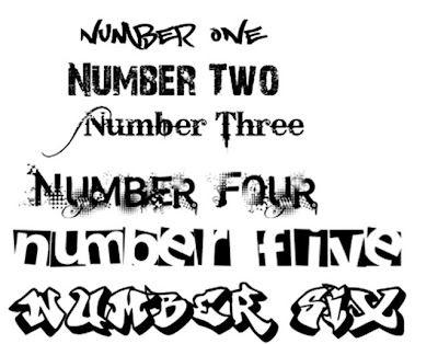
By completing my audience questionnaire i have decided that my target audience is teenagers as this was the age of the people who had answered my questionnaire. I have decided to create my magazine for girls, about fashion and relationships.I have also decided to use bright colours on the cover of my magazine, with the main use of pink as this was the most popular colour. I have also decided the text on my magazine should be bold and different as this was the text that was preferred. The price of my magazine should come to no more than £1 as this is the maximum price that people is willing to pay. I have decided to call my magazine 'Student Chaos' as this was the most popular choice.
Initial Ideas
Tuesday, 17 November 2009
Questionnaire
What sort of theme would you like to see in a student magazine?
- Fashion
- Sports
- Cars
- Education
- Technology
- Other?....
Which title would appeal to you more on a magazine?
- Student Chaos
- The Student Sundae Times
- Students Chronicle
How much would you be willing to pay for a student magazine?
- Nothing
- Below 50 pence
- Below £1
- Below £1.50
- No more than £2
What colour scheme would attract you to a student magazine?
- Black and white
- Pink and yellow
- Yellow and orange
- Grey and pink
- Blue and green
- Other?....
What sort of font would appeal to you on a front cover of a magazine?

Monday, 16 November 2009
Textual Analysis of Student Magazine.

The student times is a free magazine that is for students, made for students. The colour scheme on the front cover is quite dull and has the main colours of blue, white and red. The mast head is 'Student Times' this makes the magazine sound more like a newspaper making it seem traditional. The masthead are often recognizable on magazines so the readers know what to look for, to develop a sense of identity and to encourage readers loyalty into having the magazine when it next comes out. The layout of the front and simple, the picture on the front stands out the most and the special offers for tony and guy and a travel discount stand out enticing the reader. The audience the magazine is aimed for is a mass, as it is available to all students. The image on the front cover is of Peter K, this interests the audience as he is a recognized comedian and the picture of him as a woman is funny.
First Car

First car magazine is a magazine made for young drivers, so it is aimed at a niche audience because it is aimed at the specific interest of 17 year olds. The main colours on the front cover are yellow and white. The image on the front is of the characters from the inbetweeners this links with the banner and headline that goes across the page. The strapline is in black and white and has interesting items along it, this is in capitals that stand out to the audience. The masthead is large and in he top left of the page this makes it easier for people to recognize it when shopping for the magazine. The subheading correspond with the colour of the headline and banners, connecting it all and making it look professional and neat.
Action Plan
-Week One
Research into student magazine, textual analysis
Indetify target audience
Audience Questionaire
-Week Two
Decide on name of magazine
Organize photoshoot
Desgin first ideas
-Week Three
Complete first draft
Ask for comments and analysis
Make changes changes, update blog
-Week Four
Evaluate and make sure everything is finished
Update blog and ask for comments.


